Sheryl Jenkins
Website:vimeo.com
Twitter:@AnimatorSheryl
Instagram:AnimatorSheryl
Skills:Hand drawn, cut out and collage animation. Digital animation and editing using apps. Animation for theatre projection. Illustration. Graphic Design.
I’m an animator based in North East England. My work is a mix of arts residencies and projects with communities, collaborations with other artists, work in schools, developing independent film productions, creating animated work for television, theatre and festivals, designing artwork, illustrations and promotional material, and producing film content for online education resources.
Recent blog entries
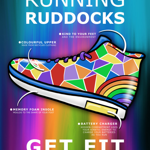
I've been playing around with poster layout ideas. I'm particularly interested in the use of repetition in a design to give a unified and consistent look.
I'm also considering colour in the design. Colour theory and the psychology of colour are important in graphic design. Different colours can have a different response from a viewer. For example red, yellow and orange are associated with appetite and used a lot in food adverts. Blue is not a colour that occurs naturally in foods so would be off putting to customers - you wouldn't want to see blue fish fingers. Yellow is one of the most eye-catching colours - I've been using yellow as a bit of a base colour to push the product forward. Yellow can also be a bit overpowering and tiring on the eye, so in some cases, it needs to be used carefully. With regards to the Rainbow Running Ruddocks, I thought a boost of yellow energy is a good thing to include in the design.
Another thought on colour, in a lot of graphic design it's good practice to limit your colour pallet - it makes a design clear and pleasing to look at. Bit with the Rainbow Running Ruddocks, I can't not have a rainbow, so it's important to be consistent with the use of colour to avoid a big colour assault! Which is why I'm bringing in the yellow.
I'm still working on ideas for the logo - I don't like the paint splatter on all lettering - the words get lost and I don't notice them. I have a new idea.
Final thing I need to decide on is the text - do I dot it about, which I like because it guides the eye to the point of the show that it refers to, but it looks untidy from a design point of view ... or do I align it all in one block so that the view isn't searching for it - got to think more on that.
I'm working on combining together elements of running shoes and hiking boots. I've played around with a few different shapes and think I might've settles on a one that has the right balance.
Next task is deciding whether to go for a landscape or portrait poster format. My initial idea was to go for landscape but after making a few rough plans I quite liked portrait with the logo/name at the top and shoe at the bottom.
I was going to go for just the one show side on but then I played around with looking from an angle, and decided that seeing the underneath (to show the battery compartment) might be a good idea.
Today I had a Zoom meeting with Ava to discuss the advertising and marketing design for her running shoes. It was good to find out a bit more about how the idea came about and talk about who the shoes were aimed at. Since my research into show designs and advertising I had started to put together some ideas for prints and patterns. We had a look through those and Ava picked some favourites for me to start developing further.
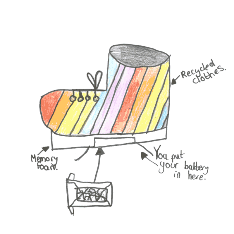
Ava had been working on a model of one of the shoes which was good to see. I have a few pattern ideas but first priority is to come up with a final shoe design that takes Ava's original sketch and combines elements of running shoes and hiking boots in a hi-top style.